Step-by-Step Guide to Creating a Text Blend Effect with HTML & CSS
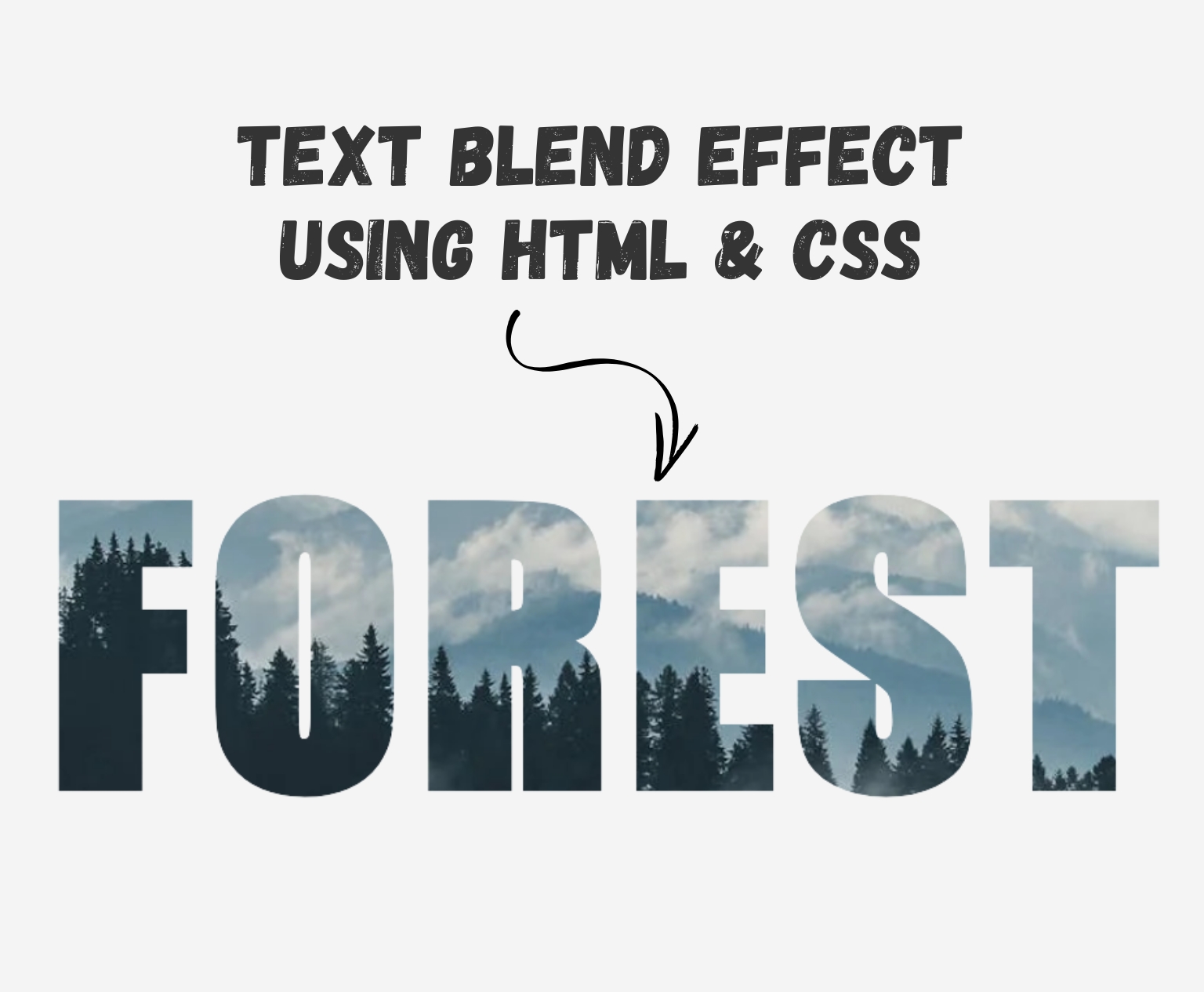
Want to add a creative touch to your website’s text? In this quick tutorial, we’ll show you how to create a cool text blend effect using just HTML and CSS. Whether you’re a beginner or looking to spice up your design skills, this trick is simple yet impactful. Let’s dive in and give your text some standout style!
Setting Up the HTML Code
Let’s start by writing the basic HTML structure for our text blend effect. Below is the complete HTML code followed by a breakdown of what each part does:
<!DOCTYPE html>
<html>
  <head>
    <link href="style.css" rel="stylesheet" />
  </head>
  <body>
    <div class="wrapper">
      <h1 class="heading-text">
        FOREST
      </h1>
    </div>
  </body>
</html>
Explanation:
<!DOCTYPE html>— This declaration defines the document type and version of HTML being used (HTML5 in this case).<html>— The root element that wraps all the content on the page.<head>— Contains metadata about the document. Here, we’re linking an external CSS file namedstyle.cssthat will style our elements.<body>— This is where the visible content of the page goes.<div class="wrapper">— A container element that wraps the heading. We’ll use this later for positioning or layout styling.<h1 class="heading-text">— Our main headline. This is the text that will have the blend effect.<span class="text-texture"></span>— This empty span will be styled with CSS to apply the texture or background blend behind the text.
CSS Code for the Text Blend Effect
Now that we’ve set up the HTML structure, let’s bring our text to life using CSS. Below is the complete CSS code that creates the blend effect, followed by an explanation of what each part does:
.wrapper {
  margin: 150px auto;
}

.heading-text {
  color: transparent;
  font-family: impact, sans-serif;
  font-size: 20vw;
  letter-spacing: 0.05em;
  background-image: url(https://images.pexels.com/photos/9754/mountains-clouds-forest-fog.jpg?auto=compress&cs=tinysrgb&w=1260&h=750&dpr=1);
  background-size: cover;
  background-position: center center;
  background-clip: text;
  -webkit-background-clip: text;
  text-align: center;
}
Explanation:
.wrapper
This is the outer container for our text.
.heading-text
This is the main text element that we’re applying the effect to.
color: transparenthides the default text color so the background image shows through the text instead.background-imagesets the texture or photo you want to appear within the text.background-clip: text(and its webkit version) makes the background image visible only through the text shape.font-size: 20vwmakes the text super large and responsive based on the viewport width.text-align: centercenters the heading horizontally.
And that’s it for the CSS part! This simple combo of HTML and CSS gives you a sleek, eye-catching text blend effect without needing any JavaScript.
See the Live Text Blend Effect in Action
Want to see how it all comes together? Check out the live preview below! This embedded CodePen shows exactly how the HTML and CSS create the text blend effect in real time. Feel free to interact with it, tweak the code, and experiment with different background images or fonts to make it your own.
See the Pen Text Blend Effect using HTML & CSS by Rohail Ali (@Rohail1123) on CodePen.
Final Thoughts
Creating a text blend effect using just HTML and CSS is a great way to add visual interest to your website without relying on heavy libraries or JavaScript. Whether you’re building a personal portfolio, a landing page, or a creative project, this technique gives your text a bold, modern look. Feel free to customize the background image, font styles, and blending modes to match your brand or design vibe. Happy coding!